So… Why a Logo, Anyway?
The store was ready. I had products, a cart, even the shipping set up. But it still felt… unfinished? Like I forgot to sign my name on it. That blank space where the logo should’ve been — it stared at me every time I opened the homepage.
Not gonna lie, I wasn’t thinking about branding at all in the beginning. I just wanted to sell my handmade skincare stuff and see what happened. But when I showed the site to a friend, she said, “It looks fine… but what’s your brand?” That hit harder than I expected.
I didn’t have a clue how to make a logo. No design background, no Adobe skills, no budget. Just a need to put a face on the business — something people might remember after clicking away.
First Things First: What Did This Logo Need to Say?
I started scrolling Pinterest. Spent way too long on Instagram. And then stood in the drugstore staring at packaging like a weirdo. I guess I was hoping for some kind of lightning bolt moment — but what I gotcha was this: the best logos didn’t try too hard. They just felt like they belonged.
Mine needed to feel clean. Soft. A little earthy, maybe. Something that made you think: yeah, this looks like it belongs on a natural skincare jar.
Weirdly enough, that part helped. It gave me something to say “no” to. Like — bold reds? Nope. Neon gradients? Pretty, but not here.
How I Ended Up Using an AI Logo Generator
I played with a few apps. Some made me feel like I needed a design degree just to understand the menus. Others gave me three generic options and called it a day.
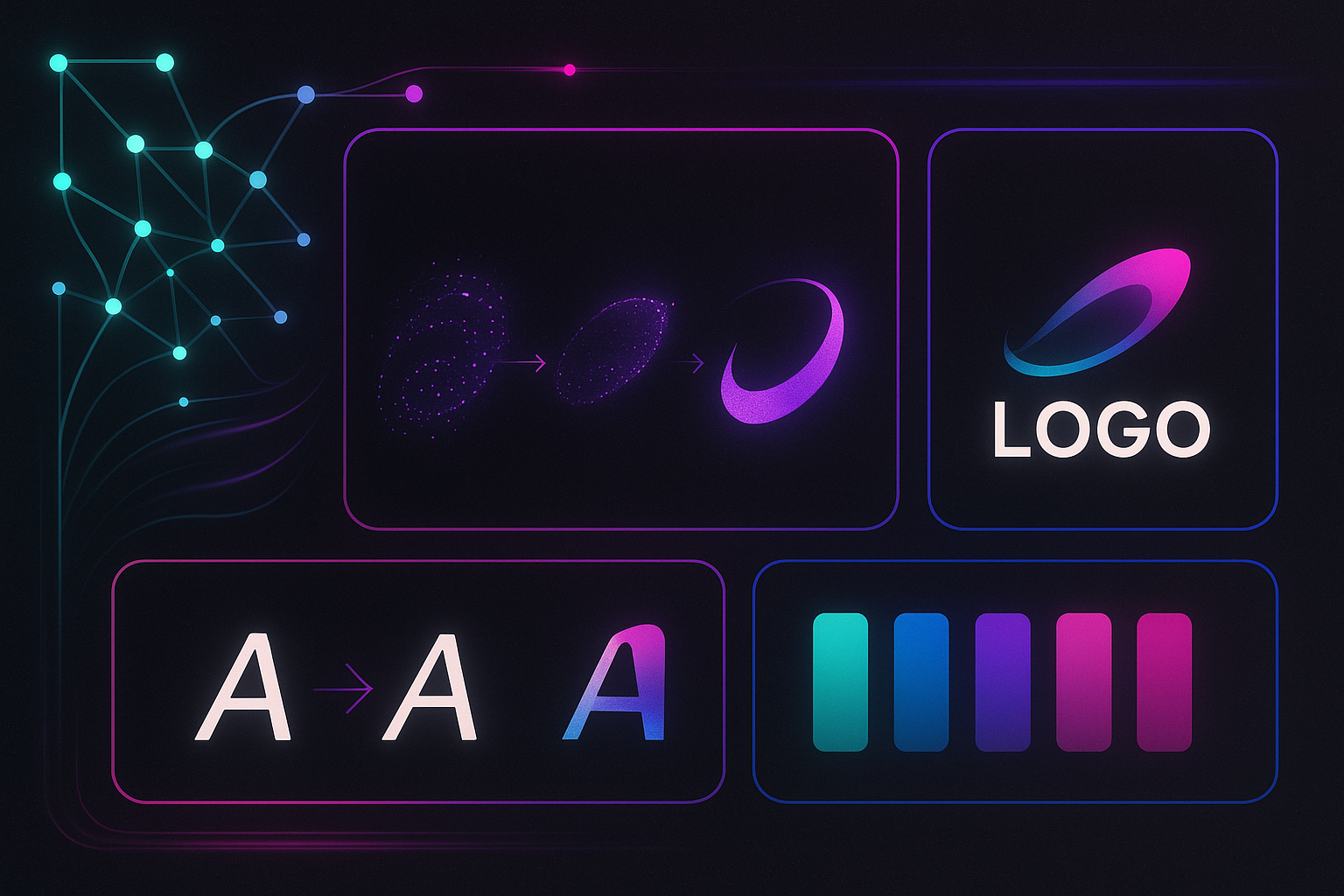
Then I found an AI logo generator that didn’t make me want to slam my laptop shut. You answer a few questions, pick some vibes, and boom — actual options that didn’t look like clipart from 2007. That felt like a win.
One that stood out was Turbologo. I mean… it didn’t talk down to me. It let me try stuff, test colors, compare fonts — all side by side. That’s how I figured out what didn’t work, which ended up being way more useful than I expected.
Mistakes I Made (And Fixed… Eventually)
I picked lavender at first. Just because I liked it. Turns out, it clashed hard with my product photos. Switched to muted greens and warm beige tones. Way better. It felt calmer, more “natural,” less “pastel cupcake.”
Same thing with fonts. Went with a swirly handwritten style — until I saw it on a tiny label mockup. Total disaster. Couldn’t read a thing. Ended up choosing something way simpler. Not exciting, but it actually worked everywhere.
Testing helped. Like — printing it out, seeing it on a tiny screen, on mock packaging. That’s when I knew if something felt off.
Feedback Sucks (Until It Doesn’t)
Asking for feedback? Ugh. I avoided it at first. Thought I had it nailed. But then someone pointed out that one letter was almost touching the icon. Another friend said the font made it look like a baby product — not a skincare brand. And once I saw it through their eyes… yeah. They were right.
Even just showing it to five people made a huge difference. One of them was a friend’s dad. Retired engineer. Said it looked “unstable.” Not the word I wanted to hear. But hey — fixed the balance, and suddenly it looked solid.
What Actually Helped (In Case You’re Where I Was)
-
Start with the feeling Don’t chase trends. Figure out what emotion your brand gives off, and work backwards.
-
Keep it boring (at first) The flashiest option isn’t always the right one. You’ll learn more from what doesn’t work.
-
Try an AI logo generator No shame in it. If you’re not a designer, these tools help you make sense of the chaos. Turbologo saved me from staring at a blank screen.
-
Mock it up. Everywhere Tiny icons, labels, packaging, websites. What looks cool at 1000×1000 might fall apart at 64×64.
-
Ask someone who doesn’t care Not your mom. Someone who’ll tell you it’s bad, and why. That’s gold.
A Logo Won’t Save Your Business — But It Helps
It didn’t magically bring in sales. But once I had a logo that felt “right,” I was weirdly more confident. I updated my site, ordered better labels, posted more often. It gave me a little nudge, you know?
I still see things I’d change. But it’s mine. And people recognize it. One customer even asked what designer I used. That was a nice moment.
If you’re just starting out and feeling stuck — try something. Mess it up. Fix it. Try again. Your logo doesn’t have to be perfect. It just has to be yours.
Media Contact
Company Name: Turbologo
Contact Person: Mikhail Khomutetckii
Email: Send Email
Country: United States
Website: https://turbologo.com